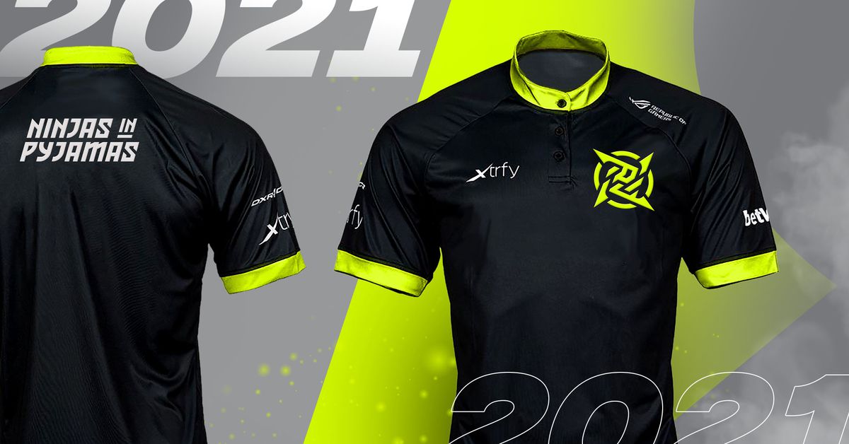
When Sunny Bonnell and her team at branding agency Motto started working with Ninjas In Pyjamas (NIP), a 20-year-old esports team in search of a new look, they did a lot of research. The team had never worked in gaming or esports before, and they wanted to understand the space. They talked to fans and people on the team, and sketched out hundreds of possible logo ideas over the course of more than a year. When NIP revealed their new visual identity last month, the reaction was immediate — and much of it was negative. “I don’t think we really knew at the time that the fans would have such a hard time with it,” says Bonnell.
NIP was founded in 2000, and the Swedish organization currently operates teams in Valorant, FIFA, and Rainbow Six, though it’s most famous for its Counter-Strike squad. Its previous logo was a gold shuriken with lots of curves and sharp points. The new iteration maintains the same concept but streamlines it, with neon yellow set against a black backdrop, and an angular shuriken that features a stylized version of the kanji for “nin” inside. It’s brighter, simpler, and more easily recognizable.
Bonnell says that the new logo was necessary for a few reasons. These include the flexibility to scale across different platforms, as well as the lack of contrast between the black-and-brown color scheme. “There were just a lot of technical issues with the existing mark,” she says. The challenge, she adds, was making a logo that not only retained the classic iconography associated with the team but also felt fresh and worked across a variety of mediums. “That mark had to do a whole lot of lifting.”
When the team started working on the project, they really zoomed in on the ninja part of the NIP name. There’s the kanji, as well as a color scheme inspired by the streets of Tokyo, and even an audio element; the designers came up with a signature blade swooshing sound for the team to use in videos and on social media. “I felt that was something they could truly own,” Bonnell says of the ninja elements. “They were lacking something to say. They had cool apparel and great teams, but they didn’t really have anything else that was giving them a story to tell.”
One of the challenges of modern logo design is creating something that can work pretty much anywhere. It’s especially tricky in esports. The NIP logo is used as a Twitter icon, a badge on jerseys, and even a virtual sticker that players can put on in-game guns. When in-person tournaments return, the logo will be blown up on big LCD displays on stage. (Bonnell is particularly excited about the last one. “It’s going to be so cool.”) To make something that works in all of these contexts, designers often resort to something flat and simple. The result is logos that tend to look the same.
“It gets trickier over time,” Bonnell says of the process. “The more you add, the more complicated it becomes.” The new NIP logo attempts to get around this in a few ways. For one, the shuriken is set on its side to create a sense of motion, as if it was being thrown. And while the logo is relatively simple, it’s imbued with meaning, like the hidden word inside the weapon. Basically, every element is meant to scream “ninja!”
:no_upscale()/cdn.vox-cdn.com/uploads/chorus_asset/file/22283624/NIP_In_Game_CSGO_Gun.jpg)
Photo: Motto
Giving an existing team a new identity is a tricky proposition. Just like in traditional sports, esports fans are attached to teams and their histories. In fact, when Dignitas and Evil Geniuses, two long-running organizations, introduced dramatic redesigns, the uproar was so intense they ended up reverting back to their original logos.
Despite all of the preparation, Bonnell says she wasn’t completely ready for the amount of blowback the NIP redesign received. “There’s a lot of hate in esports that I don’t know if I was prepared for,” she says. “I had to stop reading the comments, because I was like ‘Oh my god, I want to cry in my cornflakes.’ This is really bad.”
That has mellowed over time, she says. “The first day was rough,” she admits, but says that as time passed and the logo was displayed in more contexts — on jerseys, in actual games — she started to receive positive feedback from fans who changed their minds. While other organizations may have struggled with the initial blowback, Bonnell doesn’t think that will happen with NIP.
“First they’ll be ridiculed,” she says, “then they’ll be revered.”
This article is auto-generated by Algorithm Source: www.theverge.com


